Sky LaRoche DES157b Q3 2023
Usability Testing Results
Significant obsevation 1: Circles Look Clickable
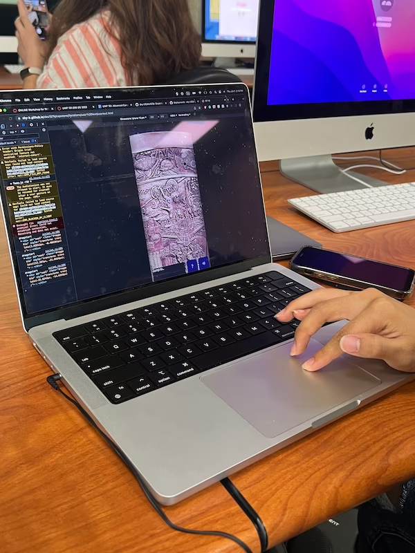
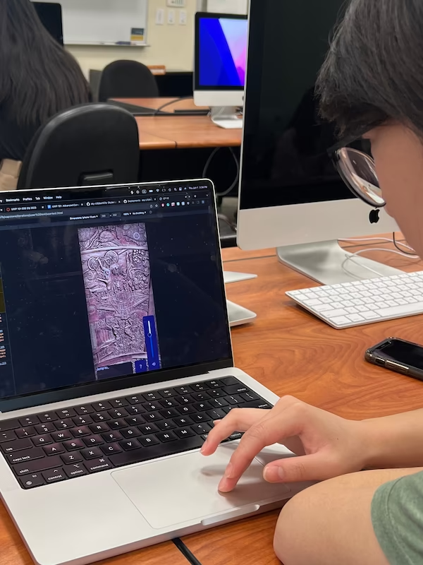
To make sure that people could see the spots that made sound (since there aren't many right now) I used small circle overlays for each point. Both of my testers tried to interact with these circles by clicking or mousing over them. In the next iteration, I'll either remove the circles or make them move along with the sound somehow so they don't just look like buttons.

Significant obsevation 2: Menus Should Close When Something Else Is Tapped
I have a few menus and overlays that come up on tap, but right now the user has to tap on the menu's button again to close it. One of my users didn't figure this out and spent almost their whole interaction with the volume overlay open. The other figured it out but only after some experimentation and later they said it was unintuitive. In the next version I'll fix it so that if the user clicks/taps on anything besides the menu they just opened, the menu closes.

Significant obsevation 3: Users Aren't Likely to Use Headphones
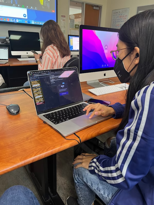
Both of my users said that if they were acessing the website on mobile at the seal, they wouldn't be likely to use headphones. This poses a minor problem as a lot of the sounds are ambient and noisy and therefore hard to hear in a noisy environment. I'm not exactly sure how to solve this issue yet, it may be as simple as making the sounds louder by default. I might also make the first sound the user hears more unnatural to the town environment (like running water or a steam train), so that they notice it and know what they're listening for moving forward.
